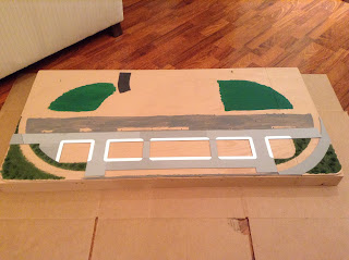
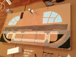
After determining the footprint of each building, I had to decide how tall each one would be. I didn't want them to dwarf the background buildings, so the maximum height would be about 5 inches. To provide some visual interest, I varied the heights of each building, alternating short ones and taller ones. I based the building heights on how many stories they would be, using a standard 10-ft story height.
Once I finalized the dimensions of the buildings, I used a computer to create the images I would later print out and glue to the building cores which would be made of foam core. Making the building "wraps" on the computer proved to be one of the most time-consuming activities, mainly because I was using a photo editing program (paint.net) that I was unfamiliar with. It was kind of like trying to fly an airplane while reading the instruction manual at the same time!
I created the images of the buildings' walls on paint.net using texture images from the website textures.com. I also used Google image searches to find windows and doors to round out the images. I wanted to include a couple of common Japanese convenience stores, Lawson Station and Family Mart, on the layout. I found suitable imagery for both and added them as first-story storefronts in the buildings on the left and right side. I added a Yoshinoya restaurant in the same manner on one of the middle buildings. Once I had created the four sides for each building, I printed them out on a color printer at my office (don't tell the boss! 😁).
Making the building cores was a fairly straightforward process of cutting sheets of foam core to the appropriate sizes and gluing them together with white glue. When cutting the pieces, I had to be careful to account for the thicknesses of the foam core so when the pieces were glued together, they would come out with the correct overall dimensions.
For each building, I made four walls and the roof. I recessed the roofs down about 1/4" below the top edges of the walls to create a little parapet around the top of each building. I reinforced the joints by gluing strips of leftover foam core along the inside corners and edges.
To break up the monotony of the plain blocky buildings, I wanted to give the building on the far right a rounded corner. This took a little while with doing the geometry calculations and borrowing my son's protractor, and at least one "do-over" for a piece that I cut the wrong size. In the end, it came out very nice.
 |
| Test-fitting building cores. |
 |
| Building core test-fit, from another angle. |
Once the building cores were finished, it was a simple matter of cutting out the printed "wraps" and gluing them to the cores with a glue stick. The last step was to hide the stark white rooftops by gluing pieces of black construction paper on them.
 |
| Finished foreground buildings in place! |
That's it - pretty straightforward and quite effective. Now that I've seen how well it works, I plan to use this technique on my HO layout in the future. If I had more time, I'd take the next step of adding rooftop details such as air conditioning equipment and elevator shaft houses. That may be a little improvement project for the next show, but for now, it's on to the next task. International Day would only be a few days away at this point!


